Lightweight themes like Astra work perfectly when used with their own page builder plugin Spectra. However, the problem comes when you have heavy plugins like WooCommerce that needs a separate setup. You need to carefully check each element of your product and shop archive layouts to make sure they are not broken and responsive on mobile devices. If you use caching plugins like WP Rocket, you should also do additional exclusions to make sure the WooCommerce related styles and scripts from Astra theme are loading properly.
Astra Pro WooCommerce Module
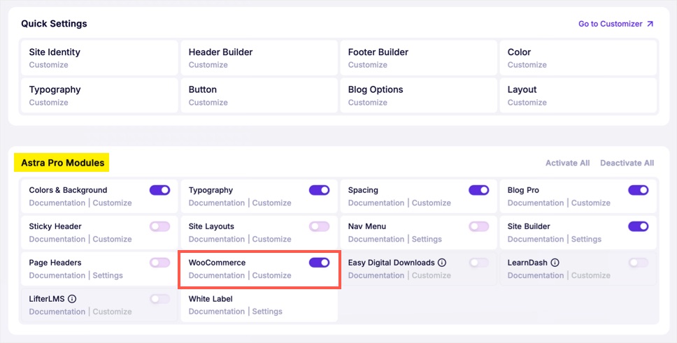
Astra Pro add-on offers a separate module for WooCommerce plugin. This helps to style the elements and customize default pages like cart, account and checkout. So, navigate to “Astra > Dashboard” section and turn on “WooCommerce” module.
After that, navigate to “Appearance > Customize > WooCommerce” section, where you can find custom options from Astra theme. Besides various settings, there are three types of pages to be taken care with WooCommerce for mobile responsiveness (we will only focus on mobile responsiveness related settings in this article).
- Archive pages like shop, product categories and products tags.
- Single product pages.
- Default pages like cart, checkout and my account.
In most cases, mobile responsiveness problems are created due to close alignment of elements. You will also receive warning and error notifications from Google Search Console with example pages to analyze further.
1. Shop Layout
Go to “Product Catalog” section and scroll down to “Shop Layout” heading. After selecting the layout, click the device icon showing next to “Shop Columns” heading and switch to mobile preview. Otherwise, switch the desktop preview to mobile from the bottom control. Make sure to select 1 for the column. This will stack the products one below another instead of loading in multiple columns on mobile devices.
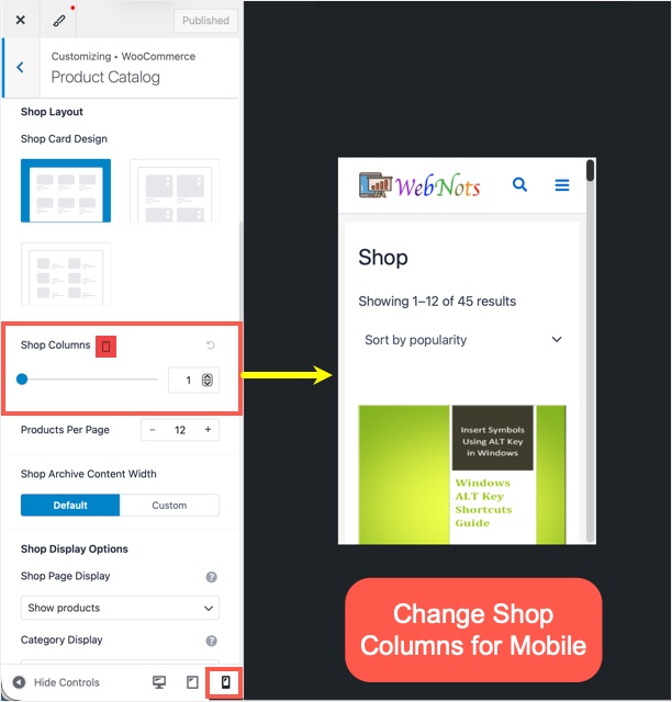
Similarly, switch the device to tablet and select 2 columns. For desktop, you can choose 3 or 4 columns depending on whether you have a sidebar or fullwidth layout.
Now, go to “Design” tab and scroll down to “Shop Card Styling” section. Here, you can adjust the button and content padding for each device to provide sufficient space between each product element in the archive pages.

2. Single Product Pages
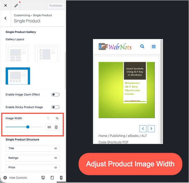
Go to “Single Product” section and set the image width based on the size of gallery or featured images used for your products. By default, this is set as 50% and check the preview (on all devices) to adjust the width.
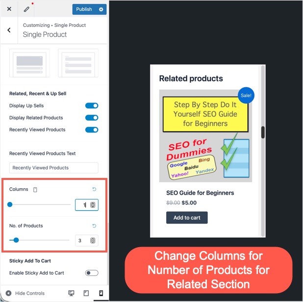
After that, scroll down to “Related, Recent & Up Sell” section. Select the “Columns” for recently viewed products to 1 on mobile, 2 on tablet and 3 or 4 on desktop. This is a single setting to change the number of columns for related products, up sells and recently viewed products. Make sure to correctly select the columns and number of products for desktop, tablet and mobile separately. For example, 1 column and 3 products on mobile will show 3 products one below another nicely. However, 2 columns and 4 products will show 2 x 2 layout which will create mobile responsiveness issue due to too close alignment of product cards.
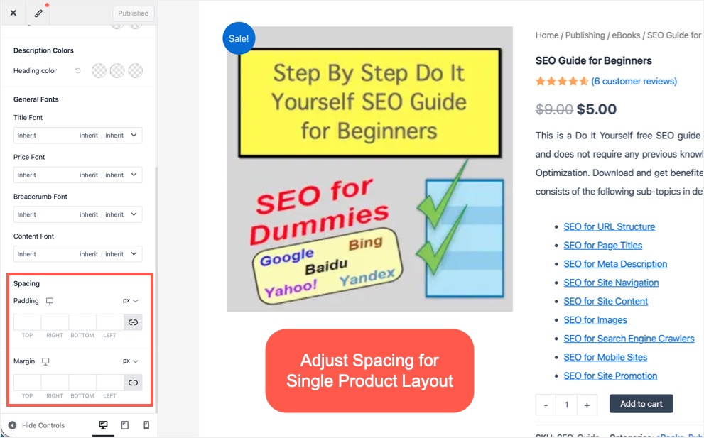
Finally, go to “Design” tab, scroll down to bottom and adjust the padding and margin spacing for single product layout.
3. Cart, Checkout and My Account Pages
Astra does not offer much from responsiveness perspective for these pages.
- Go to “Checkout” section and select single column layout if mobile view looks congested.
- Edit those pages and make sure to use fullwidth layout without any sidebar.
- Astra also recommends using Classic Editor for these pages instead of Gutenberg block editor. So, you have problem with these pages, try Classic Editor (anyway products don’t support Gutenberg as of now).
Caching and Astra
Plugins like WP Rocket aggressively cache the page’s content and in that process they may ignore the mobile CSS styles. You will see two columns shop layout on mobile as shown below though you have a single column setting in customizer.

Other caching plugins may also break your WooCommerce layout. Consider the following options depending on the plugin you use.
- Turn off separate mobile caching.
- Exclude custom CSS and JS WooCommerce files loaded by Astra theme from caching. If required, get help from Astra support to find the name of CSS / JS files used.
- Exclude all shop and product pages from caching (you can use wildcard as shown below). Alternatively, use meta box on single page (product and shop, cart, checkout and my account) to disable cache only on specific pages.


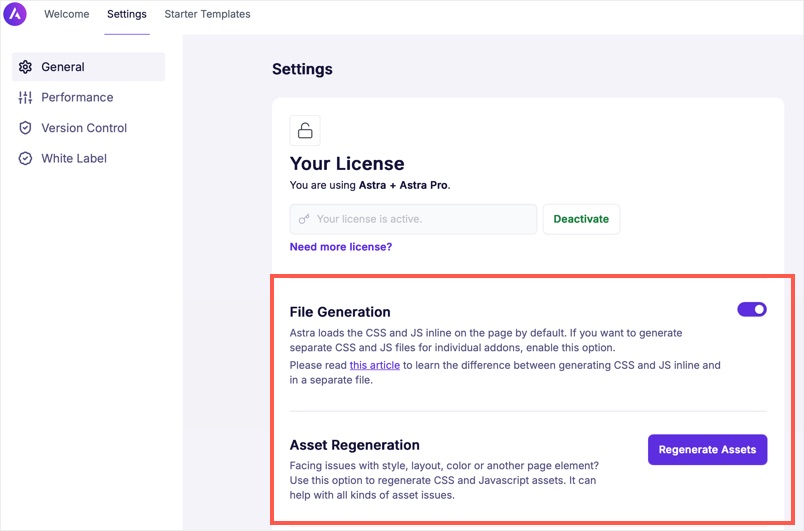
If you are using remove unused CSS feature (from WP Rocket, Perfmatters or with any other plugin), make sure to properly load the Astra CSS styles. Go to “Astra > Dashboard > Settings” and turn off “File Generation” to load all styles inline in the header. Anyway, remove unused CSS feature will combine all used CSS selectors and load in header section. If you are not using remove unused CSS feature, then we recommend to turn on “File Generation” option. After finalizing your customizer setup, make sure to click “Regenerate Assets” button to create fresh CSS / JS files with the modified settings. This will also help to fix WooCommerce layout issues on mobile due to caching or changes not reflecting properly.
Final Words
Though customizer settings are easy to configure, you may easily get lost with large number of general / design options. The trick is to spend time in checking the layouts on mobile view and fix the columns as needed. also, make sure to clear your site / browser cache and regenerate Astra assets before testing your layouts.